When it comes to branding, it's important to consider a certain brand image/logo that could be easily recognizable and link back to our trailer. Having a unique and iconic brand can make your company or product stand out from competing films in the industry and also ensure brand loyalty in terms of viewers. It allows them to trust the brand because they know of the good quality and reputation that brand may hold.
The stronger the brand, the more iconic your image will be which therefore increases popularity and draws attention to new viewers that will increase your fanbase.
When relating to the horror genre, the brand identity can consist of different varieties of brands which can conclude props, setting, logo and even font which can be a significant part of your icon.
POPULAR BRANDING IN MEDIA:
|
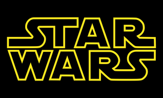
STAR WARS
Star Wars is an american sci-fi film series created by George Lucas and recently bought by the Walt Disney company. The series has spawned seven films over two and a third trilogies and has expanded outside the film industry with merchandise, book and several TV spin-offs, making it one of the most popular franchises in the media. Despite seven films being made over 30 years, the series has maintained the same font, which makes it the most memorable when it comes to recognising the brand as opposed to characters like Luke Skywalker or Darth Vader. The font may be simplistic by today's standards but it hasn't stopped attracting new viewers as the years went on. |
|
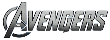
THE AVENGERS
The Avengers are a team of superheroes including Iron Man, Captain America, Thor and the Incredible Hulk which is a sub-franchise from Marvel, a company formed by Stan Lee. Throughout its 50 year run, it has gained a massive following due to the comic books, TV adaptations and the two films part of the Marvel Cinematic Universe. While the logo on the right is used for the MCU films, it has been evolved over time to include a shiny gradient and slight embossing to bring the logo into the modern age. Despite this, the actual font of the logo has stayed the same the whole time which has therefore made the Avengers franchise easily recognisable just by looking at its "heroic" brand logo. |
|
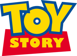
TOY STORY
Toy Story is a franchise from the Pixar division of the Walt Disney company. It has spawned three films since 1995 with a fourth coming in 2018. The franchise has been known as being Pixar's first film series and has quickly gained a massive following due to its innovative idea of toys coming to life when the humans aren't around. The logo is made of bright, primary colours which could relate to its target audience of children. The logo has been used on all three films and several pieces of merchandise and books connected to it which makes it easily recognisable along with characters like Woody and Buzz Lightyear. |
|
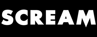
SCREAM
Scream is a franchise that specialises in the slasher sub-genre of horror that has spawned four films directed by Wes Craven. Although the franchise has spawned four films since 1997, the logo and its font have pretty much stayed the same throughout and therefore makes it recognisable to the brand conjoined with the killer dubbed as 'Scream' himself as the mask appears on a lot of scream merchandise. |
How our ancillary texts connect to our trailer in terms of branding
|
MAIN ICON:
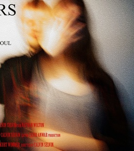
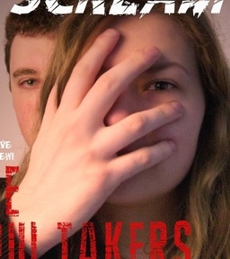
Our main icon could be seen as the main victim (Gabi) of our trailer as she is the most prominent of all characters featured and the story revolves around her beliefs of photos taking people's souls. Since we assigned her to be our main icon, we made sure to connect to her when it came to the poster and magazine. Since the trailer depicts her in danger at the very end, we mirrored this into our poster where she is caught by a "soul taker", who's unrecognisable to the viewer's eye due to the blurry filter. This could be said as to add mystery and attract the audience more. We believe that along with our main symbol, our main icon will be the first thing that comes into viewers' heads when they talk about our trailer. In terms of our magazine cover, we used pretty much a similar image of a mysterious figure putting his hand over Gabi's face albeit without any blur as I thought it would look a little low-quality for a magazine cover. However, I chose a similar photo to our magazine cover because it creates a connection between the two and allows the audience to associate the picture with our brand. MAIN SYMBOL:
Since we do not use any weapons in our trailer, we can not use objects such as knifes as a symbol for our trailer. Instead, we can use the cctv cameras as our main symbol. This is because the viewer can see a lot of close-ups on these cameras during the trailer and the story itself revolves around cameras "stealing your soul" whether it be cctv or mobile. We don't physically show a camera on our poster be the link can be seen as the killer behind our victim covers her face, which can be seen as "taking her soul" which makes it a lot more easier to recognise the title and therefore, the general idea of cameras. |
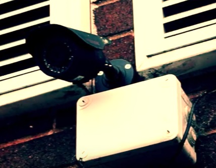
One of many CCTV cameras as seen in our trailer.
|
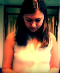
Our main victim Gabi as depicted in our poster (left), our trailer (above) and magazine cover (below the poster image)
|
